


Bright Pathways Mental Health
Brand Identity • Web Design • Digital Experience
A warm, approachable brand and telehealth website designed to make mental health care feel accessible, supportive, and easy to navigate.


Project Overview
Brand Direction
Bright Pathways Mental Health is a telehealth practice focused on creating a safe, welcoming space for individuals to heal, grow, and feel more like themselves. The goal was to create a cohesive brand identity and digital experience that feels modern, warm, and trustworthy while making services and appointment booking simple and intuitive.
Identity System
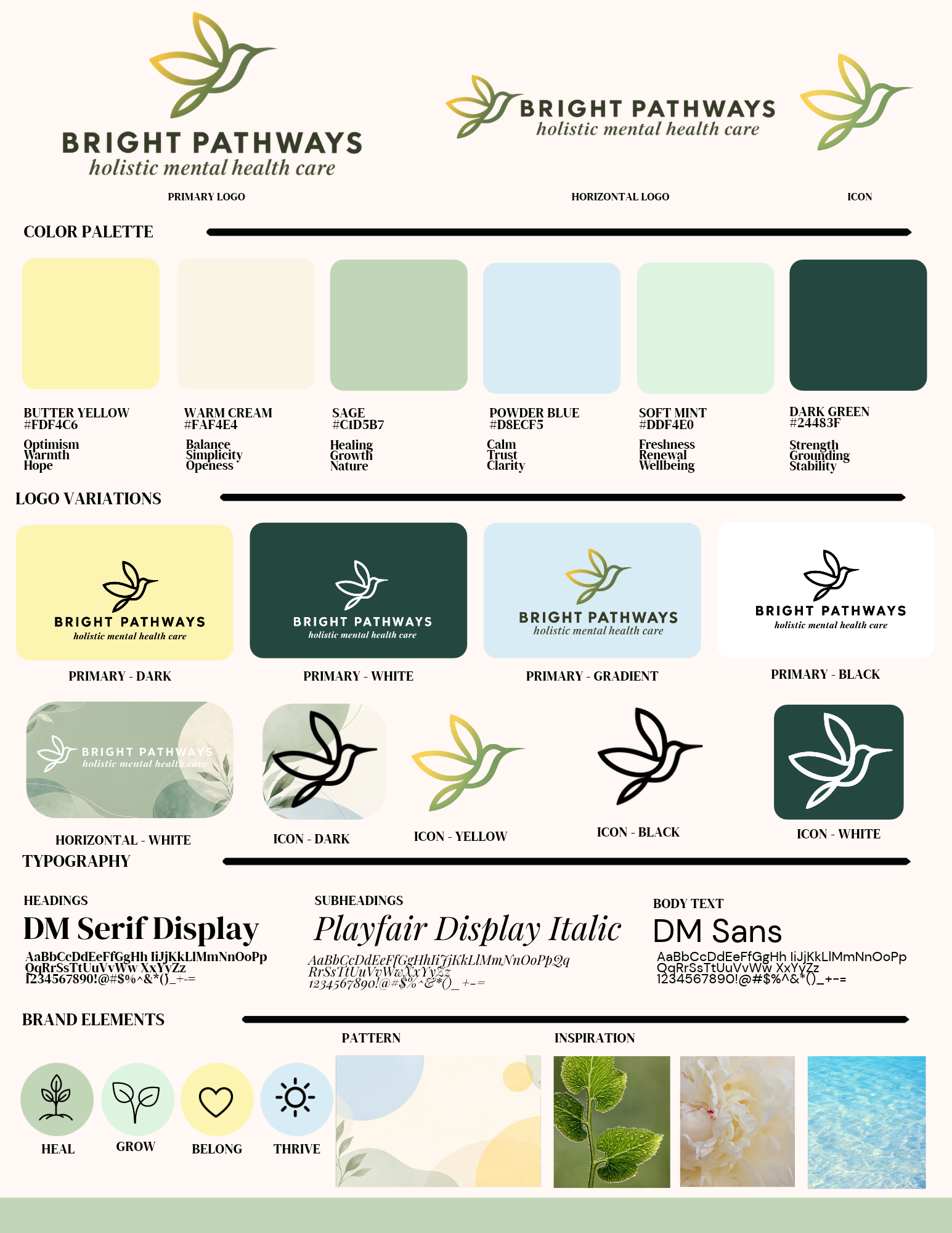
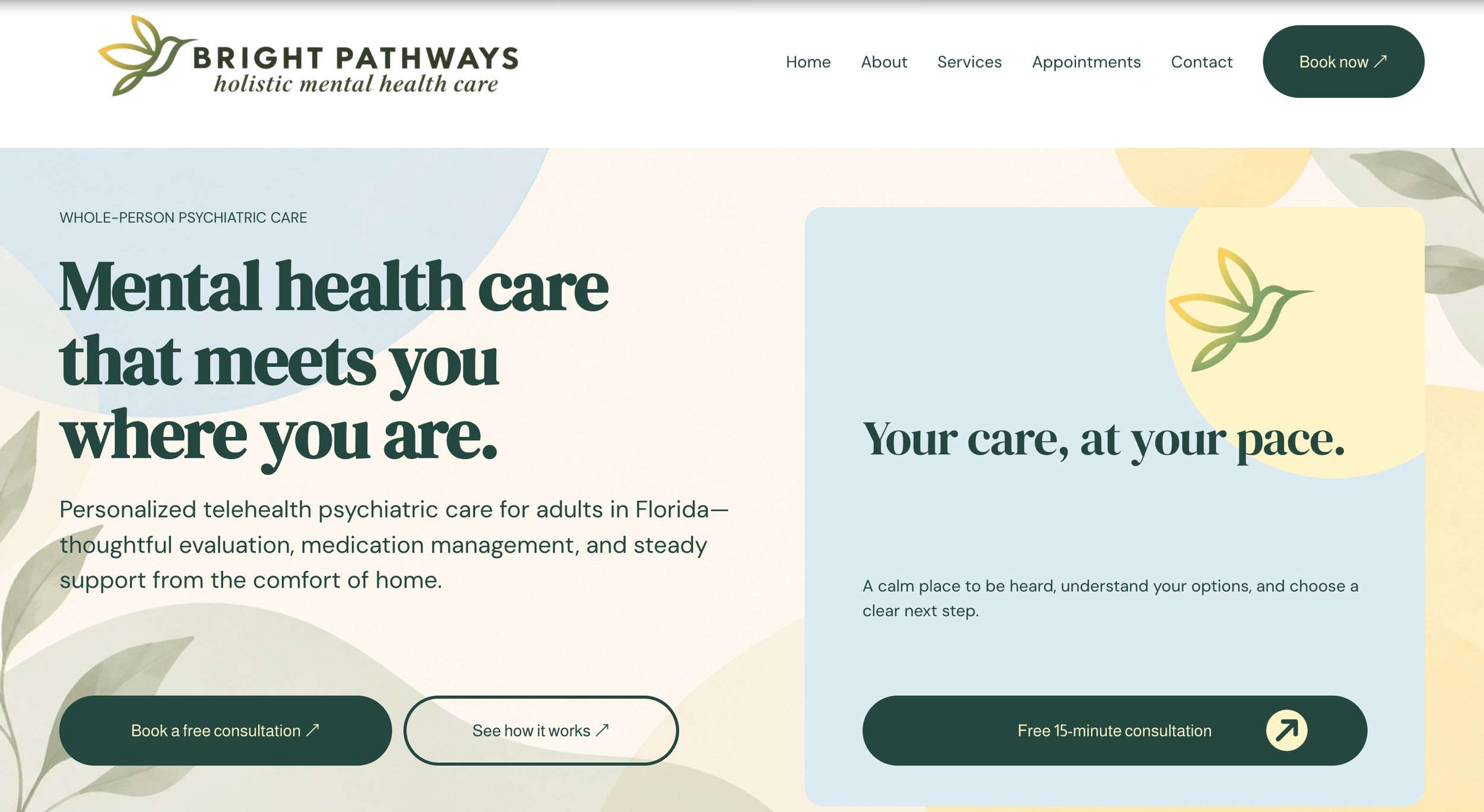
The visual direction was built around warmth, growth, and new beginnings. A soft, nature-inspired color palette, expressive typography, and the hummingbird mark work together to create an identity that feels uplifting and approachable while remaining professional.
Website Design
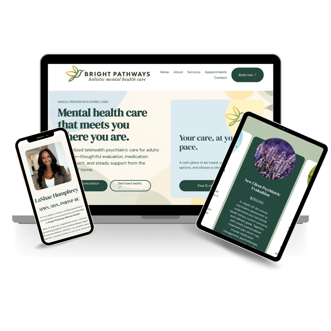
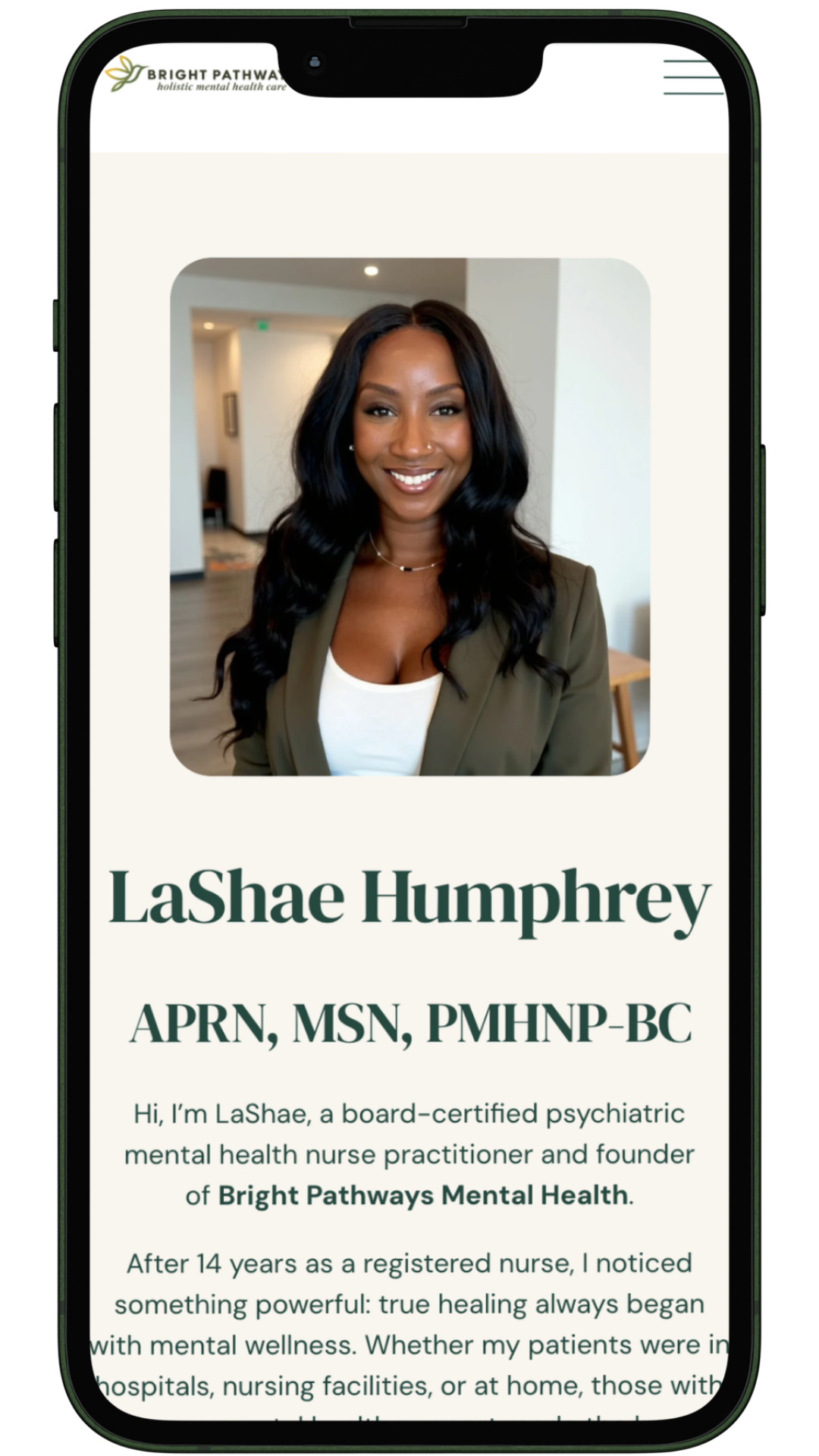
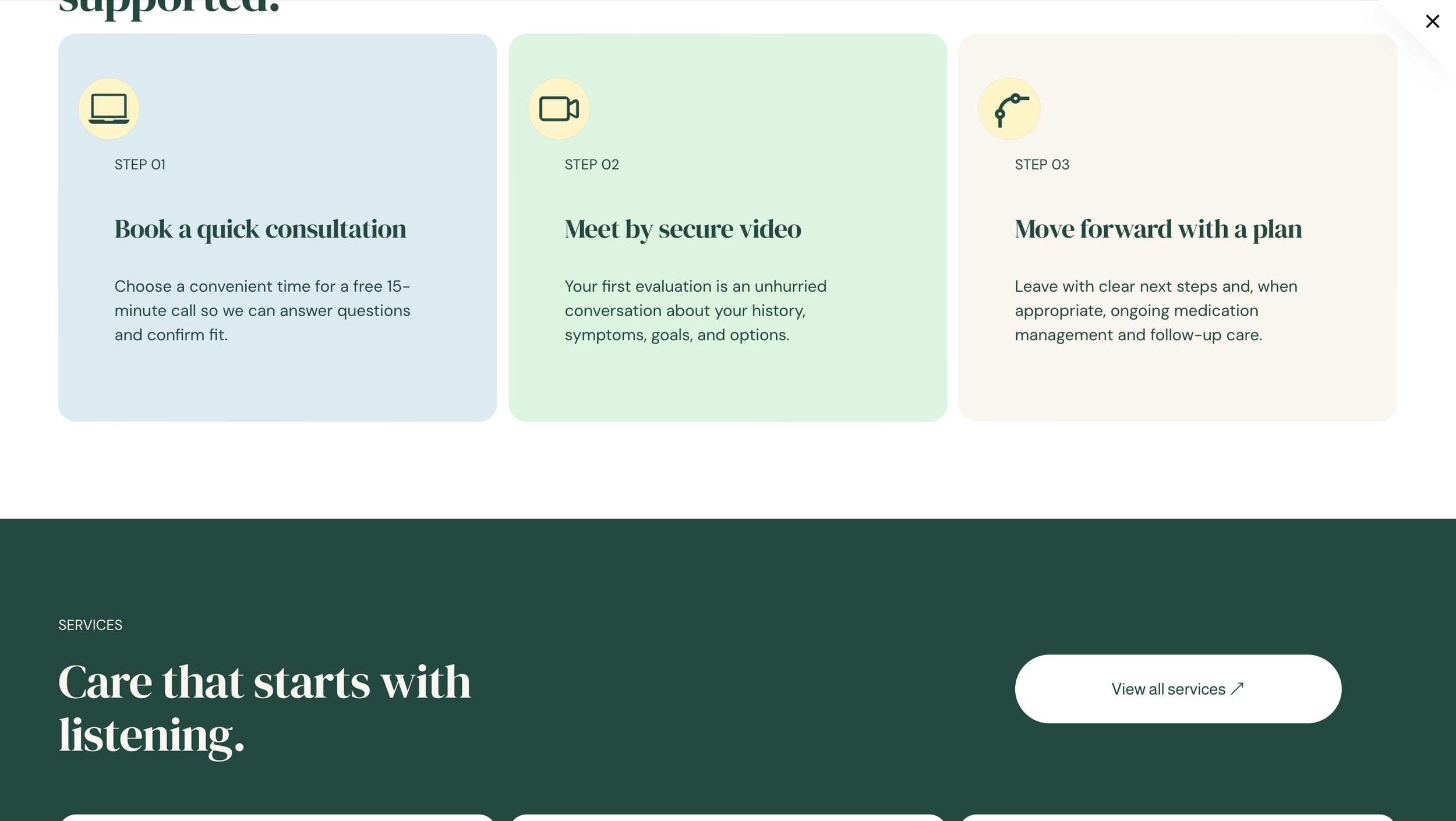
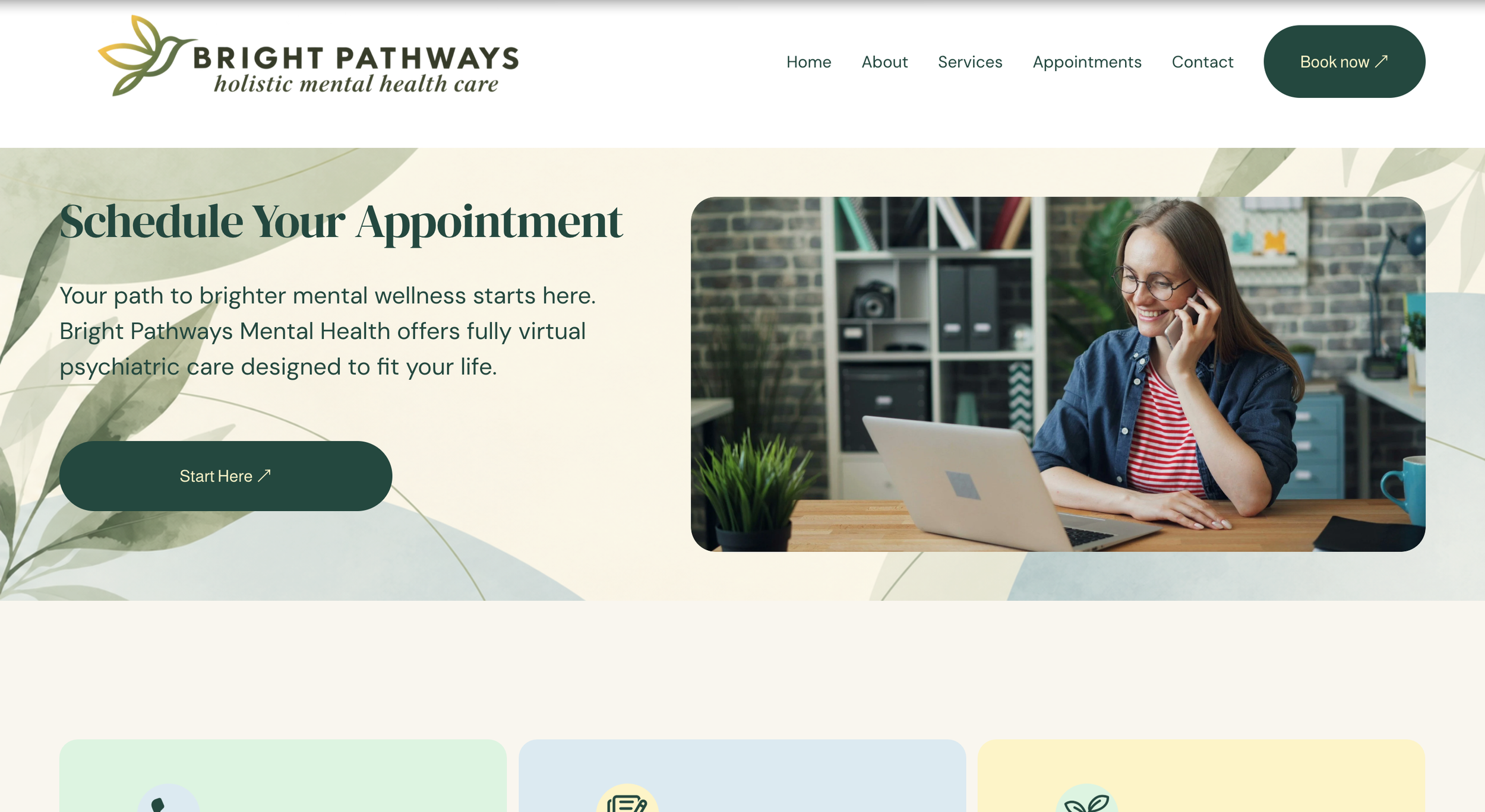
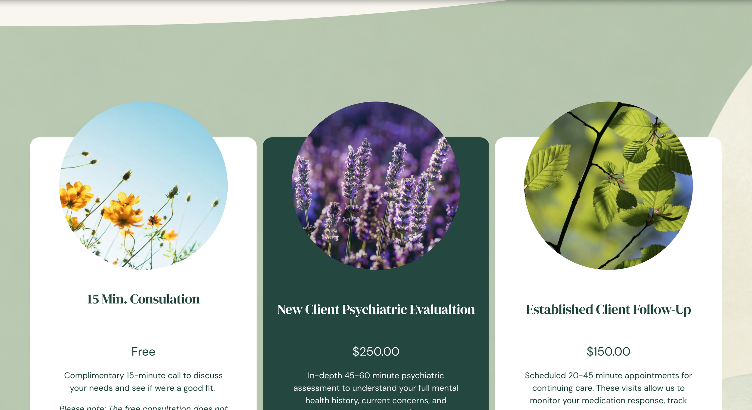
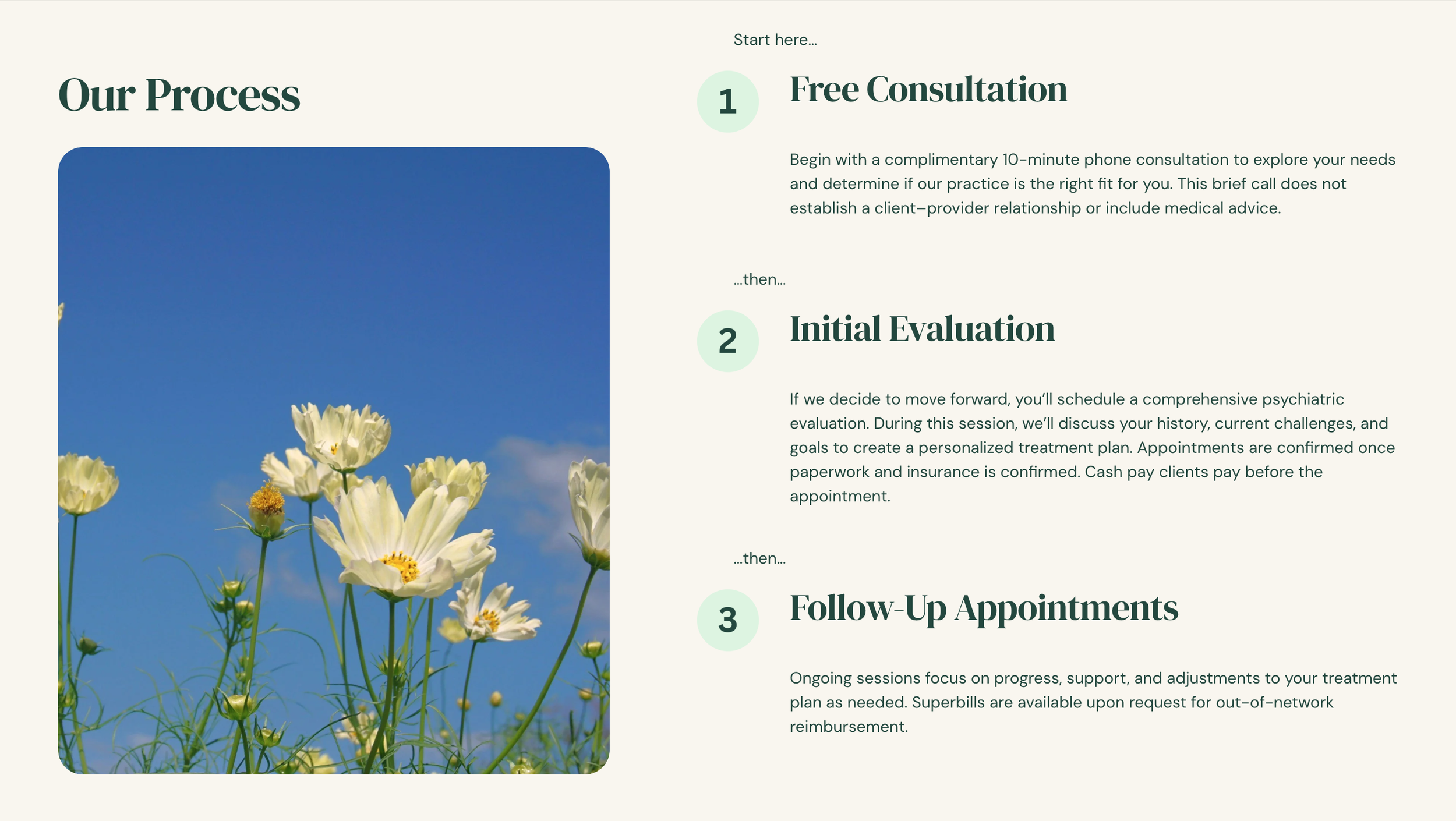
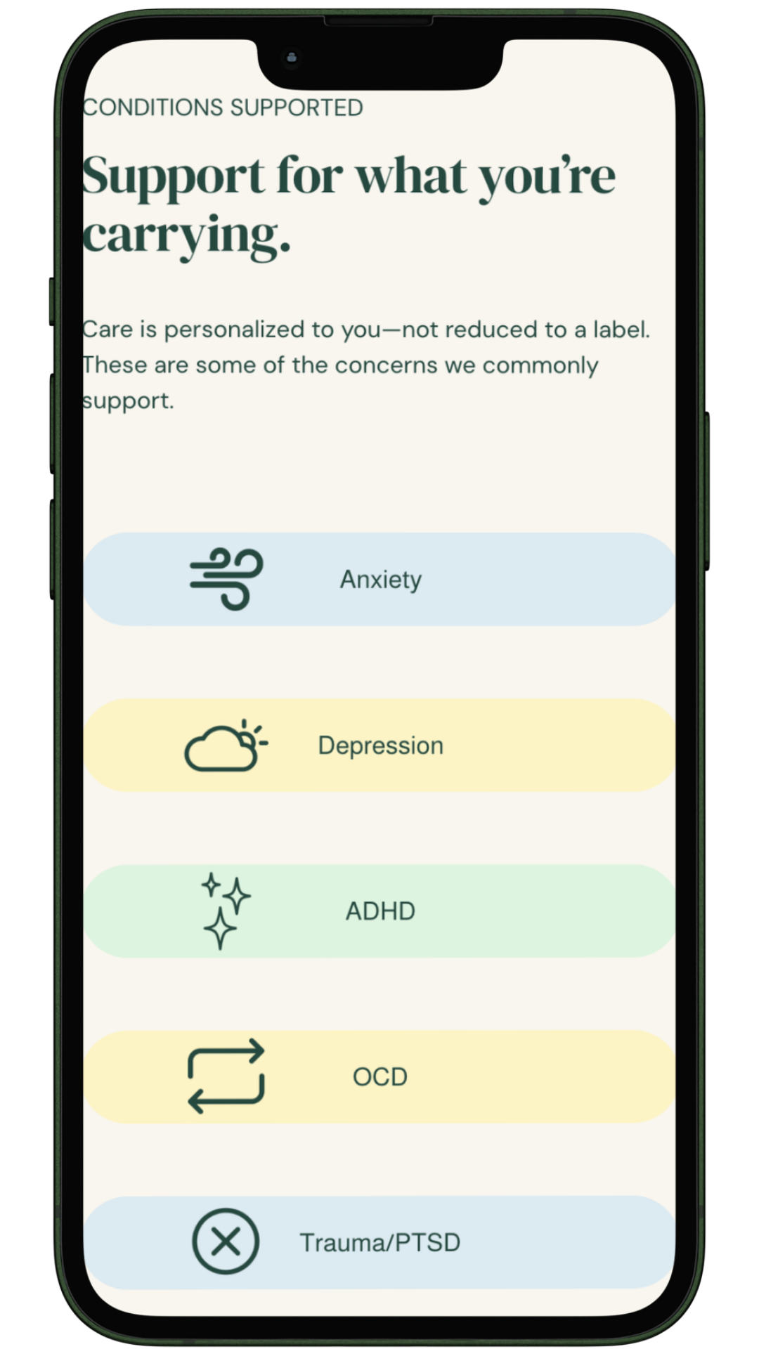
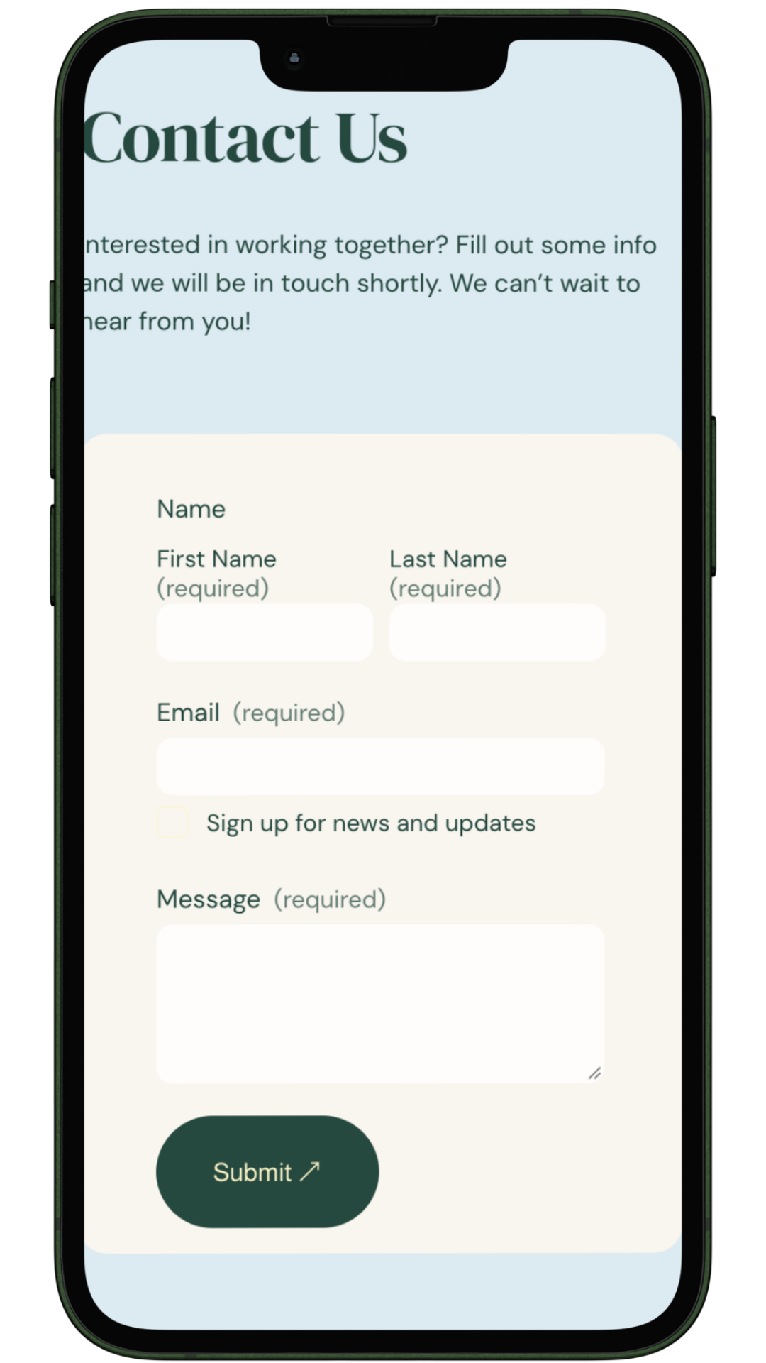
The website was designed to make finding information and taking the next step feel simple. Clear navigation, intentional visual hierarchy, warm imagery, and direct calls to action guide visitors through the practice, available services, and appointment process without overwhelming them. The experience was designed with both desktop and mobile visitors in mind.
Key Focus Areas
• Responsive desktop + mobile experience
• Clear service information
• Simple appointment booking
• Calm, welcoming visuals
• Consistent brand experience
• SEO and accessibility considerations
Optimization
We cultivate expertise through structured training and mentorship that empower teams to drive sustained progress.
The Thinking Behind It
Mental health websites carry an important responsibility: visitors should be able to understand where they are, what support is available, and what to do next without having to search for answers.
Every design decision (from the navigation and page structure to the imagery, color, and typography) was made to create a digital experience that feels clear, supportive, and human.
Brand Applications
The visual identity extends beyond the website through branded social media content and reusable digital assets.
These supporting pieces were designed to give Bright Pathways a consistent visual presence while allowing the brand to grow alongside the practice.