

Pure Nectarz is a beverage concept inspired by honey, fresh fruit, and the natural systems behind both.
I developed a vibrant identity and packaging system that combines bold typography, fruit-driven color, and honeycomb-inspired details to create a product that feels fresh, playful, and instantly recognizable.
Pure Nectarz.
BRAND IDENTITY & PACKAGING
STRATEGY
Sweet By Nature. Bold By Design.
Pure Nectarz was built around a simple idea: make natural ingredients feel energetic rather than expected.
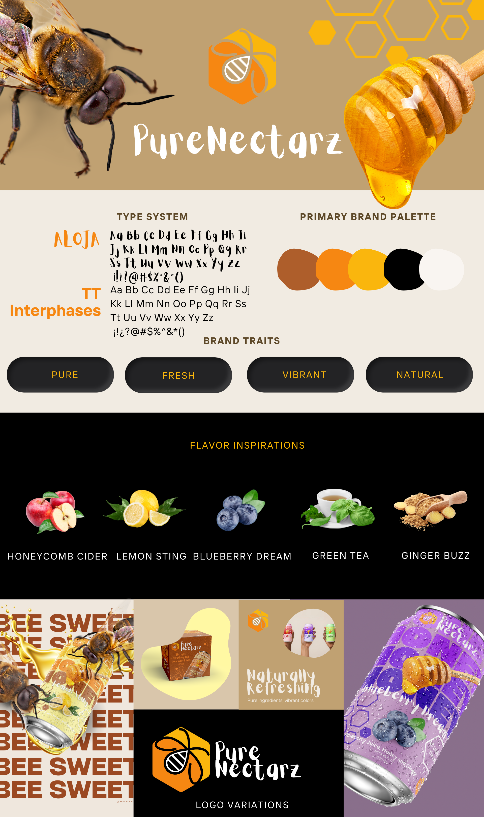
Honey became more than an ingredient—it became part of the visual language. Honeycomb geometry, fruit imagery, saturated color, and playful typography work together to connect the product to nature while giving the brand a contemporary personality.
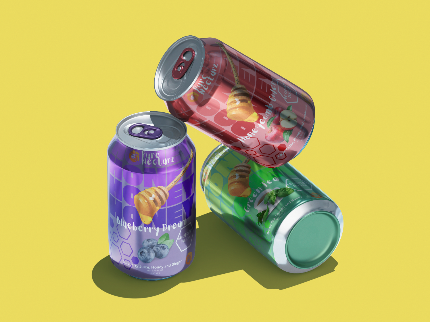
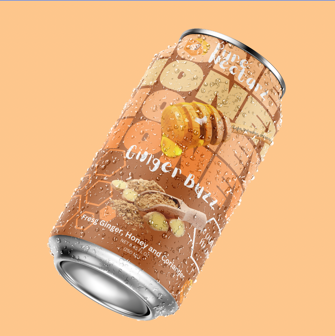
The packaging system balances consistency with personality. A recognizable typographic structure and honeycomb details connect the collection, while individual colors and fruit illustrations give each flavor its own identity.
Together, the system creates a family of products that can expand without losing what makes Pure Nectarz recognizable.
Made To Stand Out.
PACKAGING

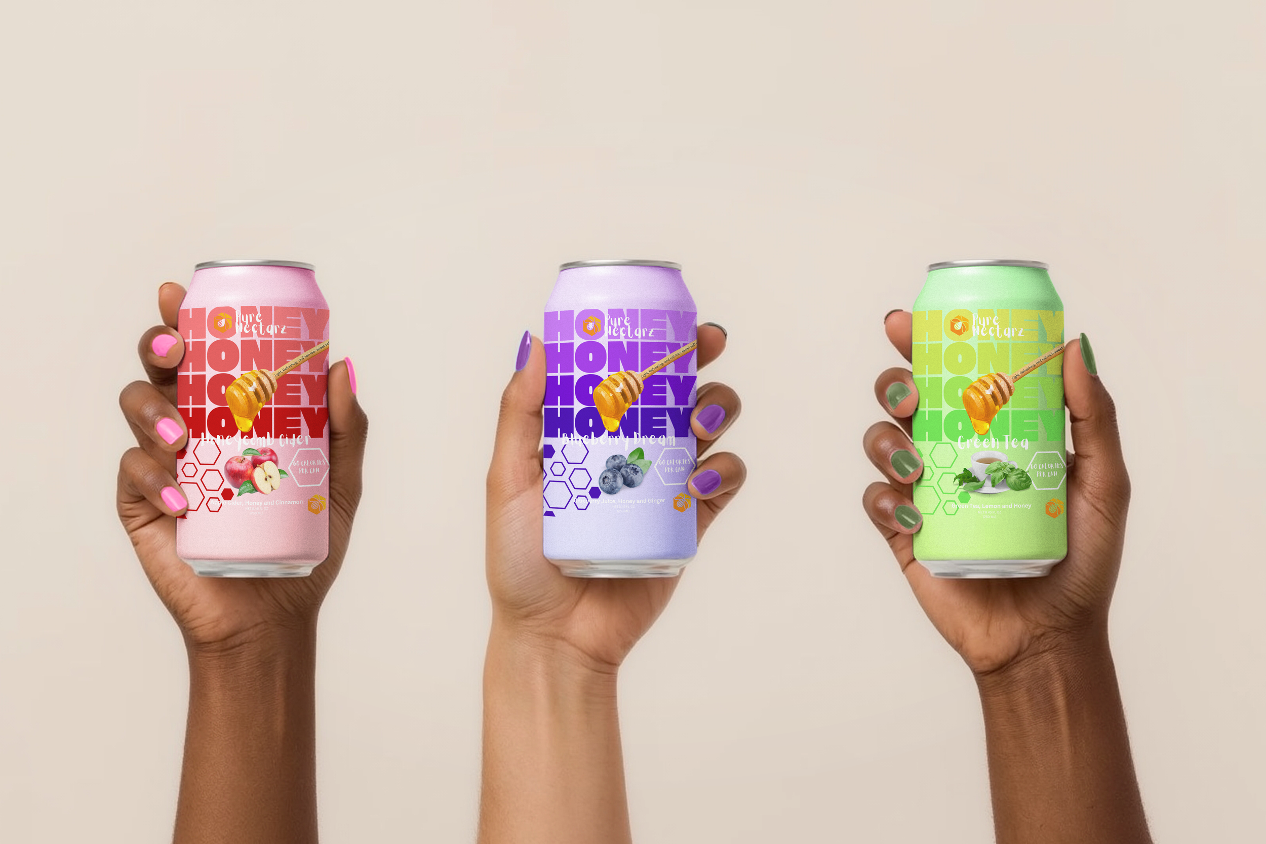
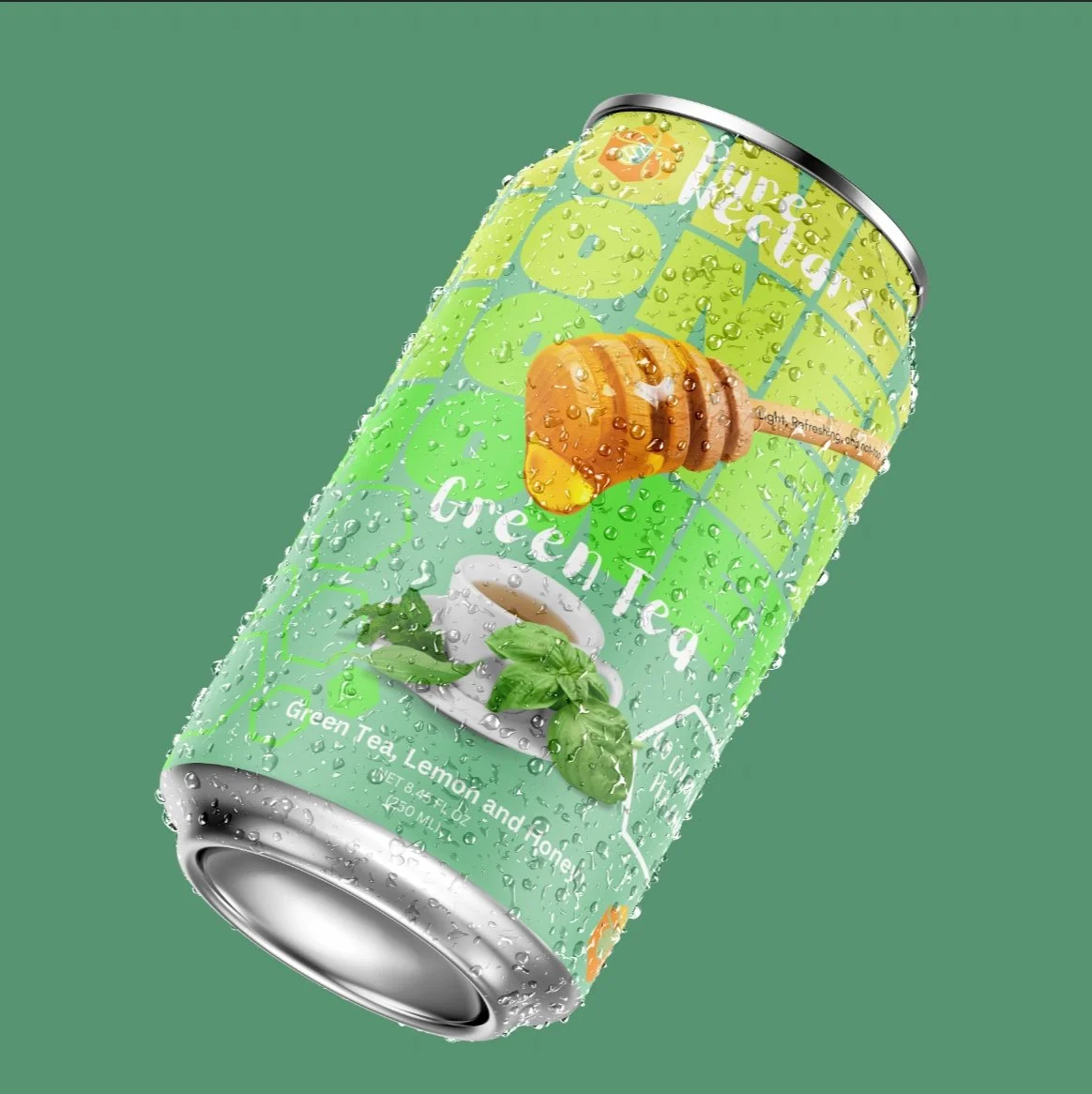
Each flavor introduces its own color story and fruit imagery while maintaining the same core visual system.
The result is a collection designed to feel varied at first glance and unmistakably connected when seen together.
One Brand. five Personalities.
FLAVOR SYSTEM


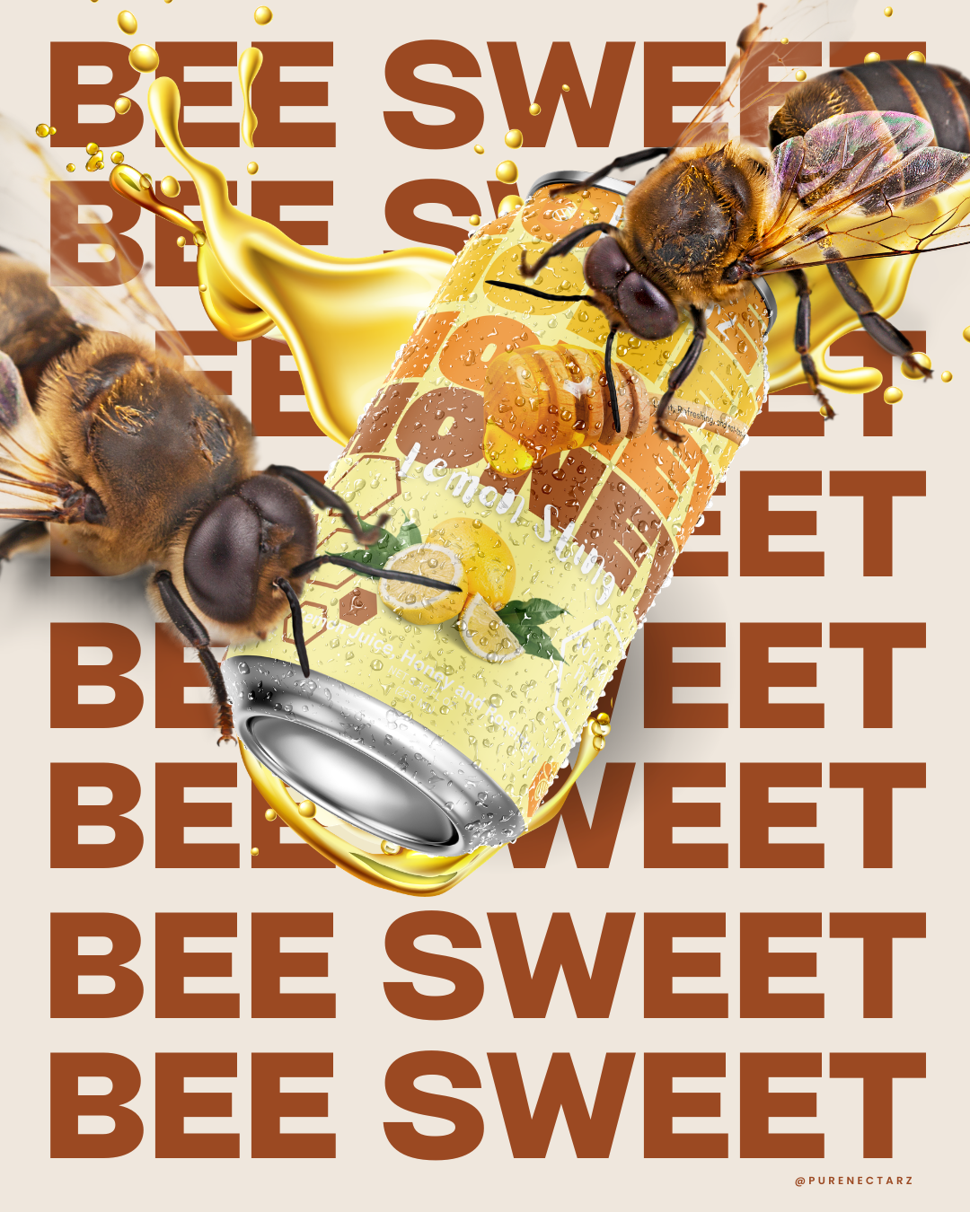
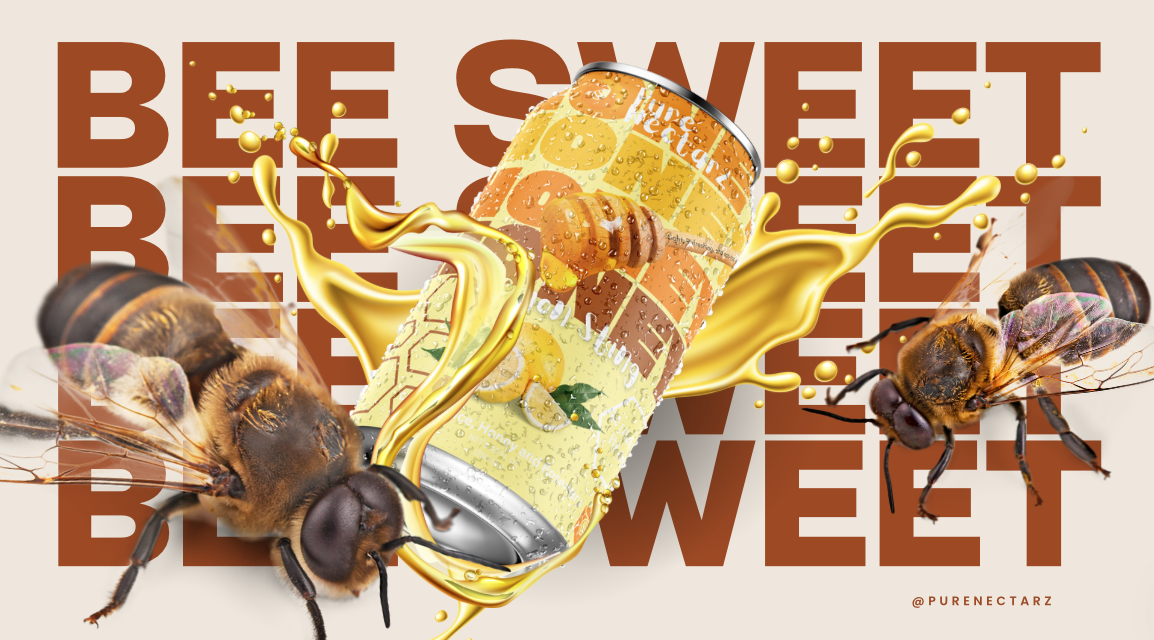
The visual identity extends beyond the package into campaign-driven artwork. “Bee Sweet” transforms the brand’s core ideas—honey, bold typography, and product imagery—into a graphic composition designed to stop the scroll.
Bee Sweet.
CAMPAIGN / ART DIRECTION
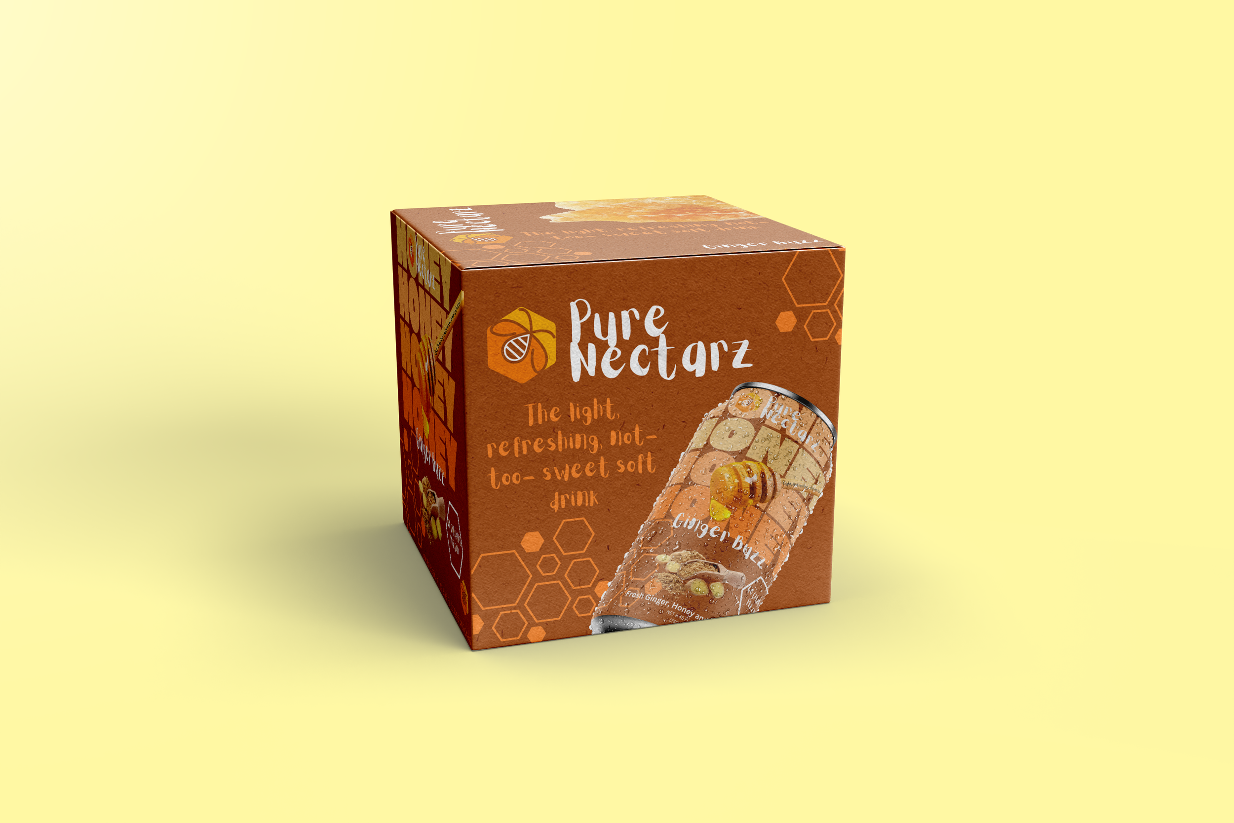
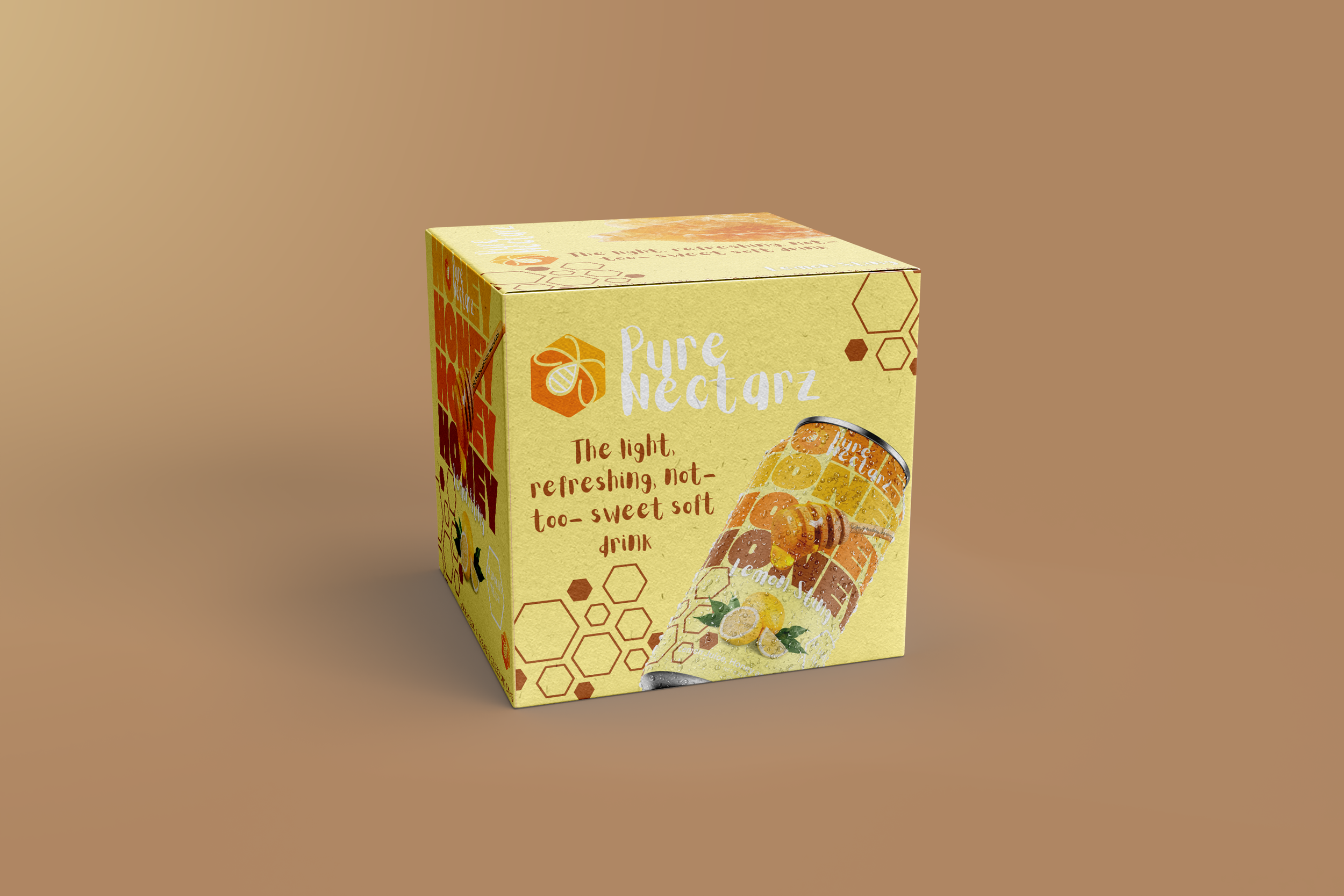
Pure Nectarz was designed as more than a single packaging concept. The visual system can move across multipacks, promotional materials, digital campaigns, and future product extensions while maintaining a consistent brand personality.
Built Beyond The Can.
BRAND APPLICATIONS

Naturally Made to Stand Out.

Pure Nectarz brings together bold typography, vibrant color, and nature-inspired details to create a beverage identity that feels playful, fresh, and full of personality.