
BRAND IDENTITY / PACKAGING DESIGN / BEAUTY BRANDING
yuzu skincare.
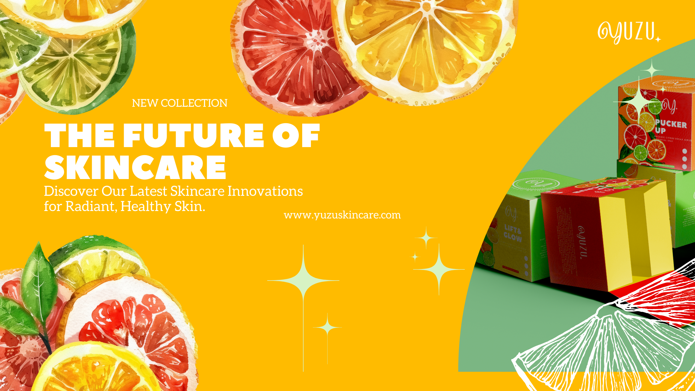
Yuzu is a playful skincare concept inspired by the bright, refreshing energy of citrus.
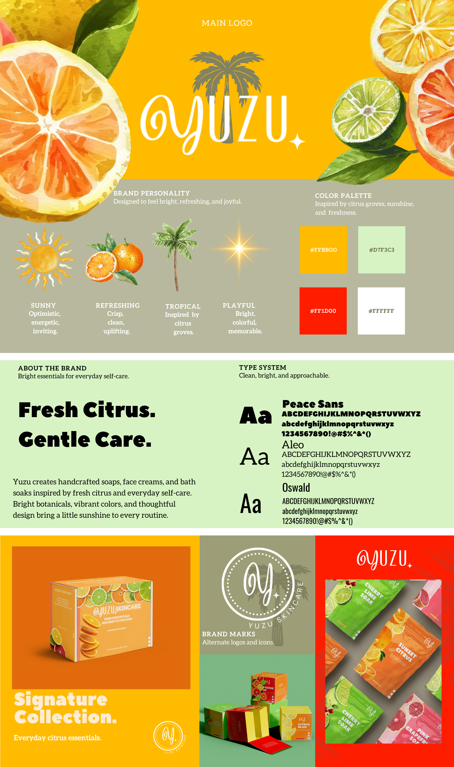
I developed a colorful identity and packaging system that brings together natural ingredients, bold imagery, and an energetic visual language designed to feel fresh, modern, and approachable.

The creative direction translates the freshness of citrus into a skincare identity that feels energetic without losing the clean, modern qualities associated with beauty and wellness.
Bright color, fruit-inspired imagery, and playful typography work together to create a visual system that feels youthful, expressive, and cohesive across every touchpoint.
STRATEGY
Fresh by Nature. Bold by Design.
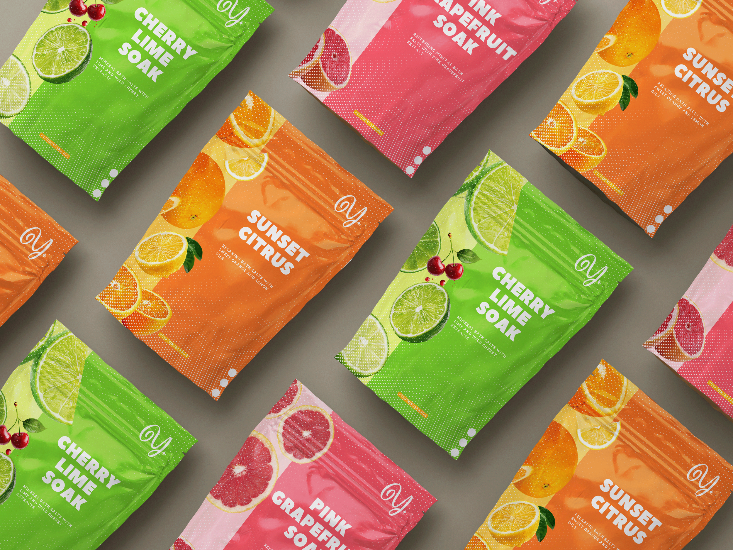
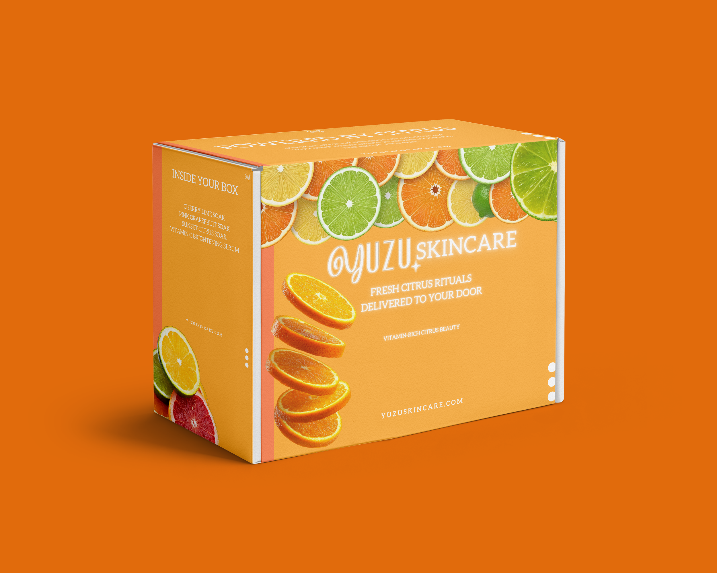
The packaging system uses bold color to distinguish each product while maintaining a recognizable visual language across the collection.
Citrus imagery, clean typography, and playful details give each variation its own personality while keeping the full product family unmistakably Yuzu.
Feel Fresh.
PACKAGING
DIGITAL / BRAND APPLICATIONS
A Brand Built to Stretch.
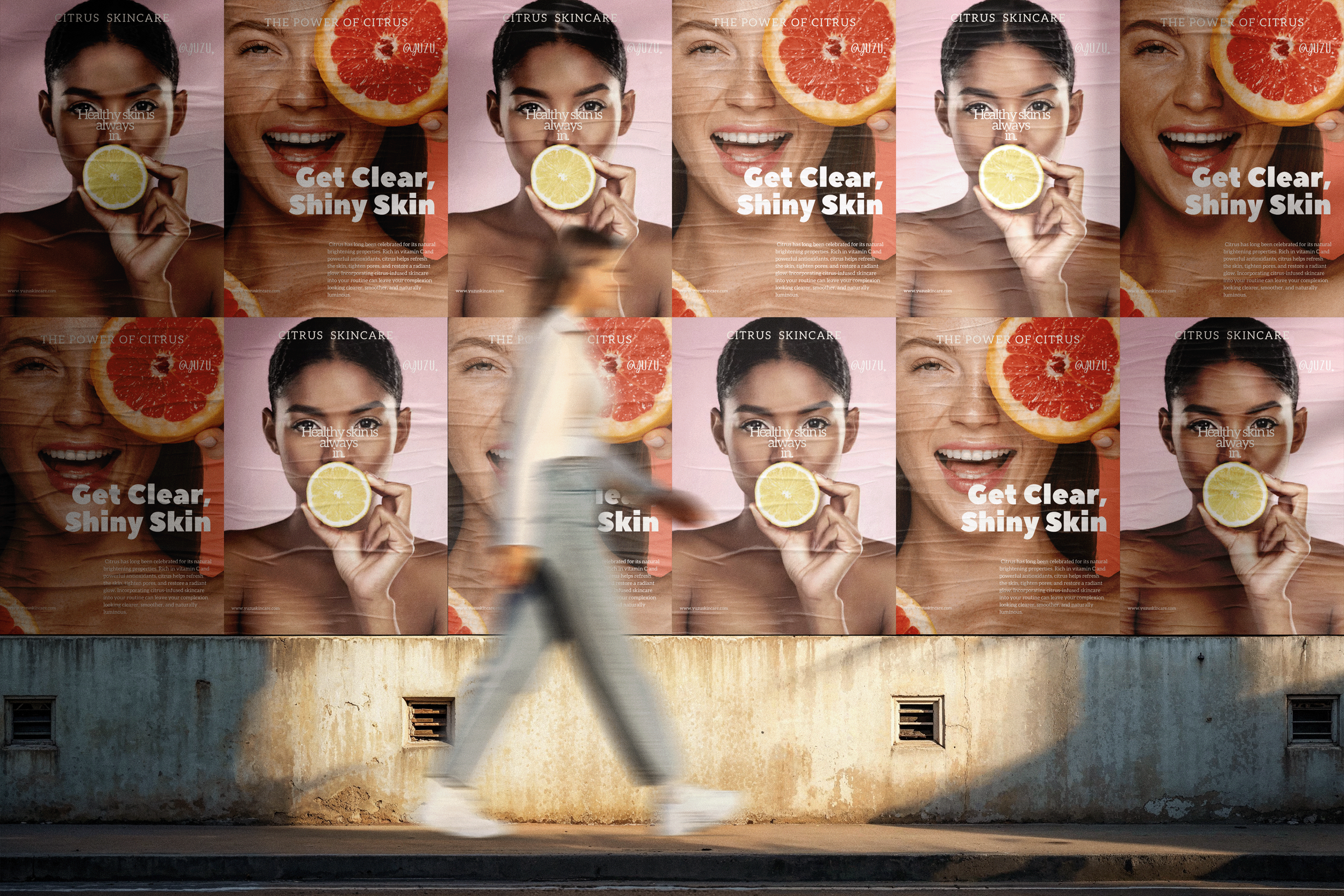
Yuzu’s identity was designed to move beyond a single package. The color system, citrus-inspired graphics, and bold typography create a flexible visual language that can expand naturally across products, campaigns, and digital touchpoints.
The system stays recognizable while giving each application room to feel playful, fresh, and distinctly Yuzu.
SOCIAL CONTENT
Fresh From the Feed.
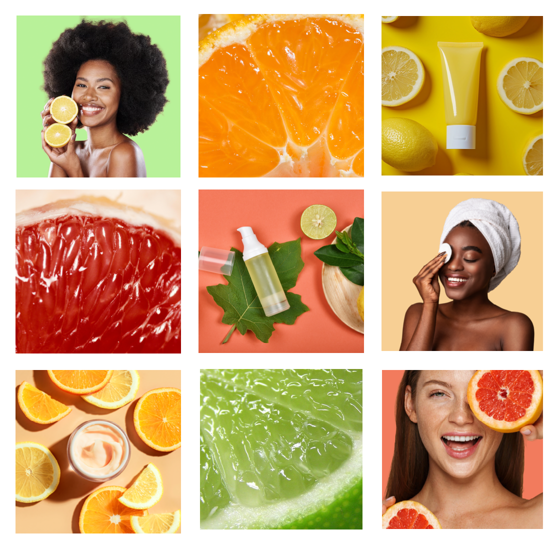
The identity expands into digital content using the same bright palette, citrus imagery, and playful compositions established throughout the packaging.
Together, these applications show how Yuzu can maintain a recognizable personality across product promotion, social content, and campaign visuals.



see what’s next.
Explore more work across branding, digital design, and creative strategy. Use the arrows to continue through the portfolio.